4. How did you use media technologies in the construction and research, planning and evaluation stages?
This question was worked as a group.
Additionally...
YouTube
The Internet was a vital piece of technology that has helped us throughout the whole process of the development of our coursework for both the main and ancillary task. The first use of the internet was for the research in to music videos and then more deeply into the music genre our group was going to focus on. Global site YouTube has helped our group massively as we were able to load up specific videos that related to our genre and analyse them and take key conventions out of them. If we did not have access to a video site that shows music videos, then we would have had to have sat in front of a TV and analyse the videos that we were given, something that may not have even been beneficial to our genre of music. As well as this, the internet meant that our research in to our ancillary tasks was genre appropriate and that we carefully analysed the images that were on the screen. For example, from looking at adverts for Rihanna we realised that the artist is always in the forefront of the advert. We were also able to look at the house style between album artwork and magazine adverts, thus keeping our brand identity. Using the internet enhanced our knowledge into the music industry, and if we did not have access to this, then our research stages would have been heavily delayed.
As well as researching just in to music videos themselves, we also were able to use the internet to aid us in how to construct one ourselves. Before the project was tasked to us, none of us knew how to operate Final Cut to a standard that was required, and the internet had many videos and forums (such as this video) that we were able to locate and heighten our knowledge. Without the internet in the research stages of our coursework, we would never have been able to identify how to professionally construct an appropriate media package that has a consistency with the music video.
The internet was also used in the planning stages of our coursework. Before we set off and started to film anything, we had to plan where we were going to go and the use of google maps enabled us to easily identify where it was we were going to film.
Google Maps - London Bridge Before We Went Up
Another key website that was fully taken advantage of was this particular website, Blogger. The website allowed us to ‘blog’ our stages of our work in a neat and professional manner where we have access to other peers studying the same course, which is ideal for product feedback. This use of communication helped us to identify weaknesses and improve the quality of our video and ancillary tasks. The website allowed us to exhibit all of our work which is a fantastic way to place work as the media is becoming more and more dependent on the internet. If we did not have use to blogger, then we would have had to written the whole of the coursework by hand, which would have been time consuming and messy.
Other internet sites such as Prezi, Viemo, and GoAnimate were used. Prezie, which was useful in our planning stages was effectively used as it displays a presentation style piece of work in an aesthetic way, and vimeo was used to upload our final cut and showcase our video as it was of a higher quality than uploading it to YouTube or as an mp4 format. GoAnimate was another way that I showcased my work. Instead of simple text, I created a animated person who spoke certain pieces of the text, such as the one that can be found here. Without the internet and the sites that are available we would not have been able to produce such a media rich portfolio throughout all of the stages of the coursework.
3. What have you learnt from your audience feedback?
Throughout the process of the development of our coursework, we sought feedback in order to try and achieve the best possible media package that would appeal to an audience and look real. The main times that we gained feedback from peers and the teacher was after the animatic, after the rough cut, and then after the final cut and ancillary tasks were completed. We were also given constructive criticism throughout the stages of our work by our teacher which was helpful so as were constantly able to better our work.
The first form of feedback we had was verbally from our teacher in regards to our animatic. This feedback was not recorded at the time, however we were told that the animatic was good in the way that it had been edited, and that if we were to stick with filming what we had planned, we should have a pretty realistic music video. With this in mind, we went out and tried as hard as possible to fit to our animatic and altered filming where it was necessary.
The next feedback that was gained, was from all of our peers and teacher. As a class, we all went over to each others computers and watched each music video and left feedback for the group to view. The above picture is an image that shows the written feedback that was gained from this process. The feedback is also explained in this post. Having this feedback helped our group dramatically. Originally, we had produced a video with a few gaps that lasted nearly 5 seconds in. As well as this, the majority of the video was too dark for the audience and no one really understood what was going on. This feedback meant that as a group, we had to come up with an action plan on how to rectify the problems. We appreciated that what our peers had told us was all correct as that age group is essentially our target audience, so we listened and tried to change everything that we could. Our feedback from the rough cut meant that we had to plan our work more carefully so that we could produce a good video.
Because of this, we planned to go up to London a lot earlier than before and re film more or less the whole video again so that we had the best possible light available to us. The other feedback that was taken on board from the rough cut, was the lack of a story line as such to the narrative part of our video. Originally we had random shots of traffic and over cranked footage which was pretty much sloppily thrown in to place to fit the music, but we were quickly informed that this was not understood and needed to be removed.
Feedback
So, as well as re filming, we also completely changed some of our ideas and started to actually film the life around London and focused more on the people walking around and going about their every day lives. After we had taken this footage back to the classroom and begun to edit it, we realised how bad our attempt at the rough cut actually was. The feedback from the rough cut taught me in this instance that we needed to convey some sort of story line, or have some form of visuals that the audience could actually say 'ah, i know what that is about'.
Feedback
After the final cut was edited, we all got together as an A-Level media group and watched the videos together and made notes on what we liked and disliked. This feedback was brilliant as it enabled us to briefly tweak our final video before we submitted it for final marking.
With the ancillary tasks, I showed a few of my friends online what my group had produced and then asked them to complete a short survey depicting what they thought about everything.
Survey From Media
The questions that I asked were:
Do you think that the three products relate to each other in a professional way?
Do you think the music video has been edited well?
Is the music video believable?
Do you think our model, Glenn, fits the song well?
Do the ancillary tasks look similar?
Do you think the ancillary tasks promote that artist well?
Is there anything you would change about any of the three products?
The survey was posted on social networking sites Facebook and Twitter and people who wanted to did the survey for me. In total, I had 16 responses. Below I will analyse each question and their responses.
Responses:
1.Do you think that the three products relate to each other in a professional way? Out of 16 people asked, 15 agreed that the products did in fact relate very well together and looked professional. This has shown to me and my group that we have achieved what we wanted in creating a professional product. I can also infer that we have managed to achieve promoting our product to our desired target audience as the vast majority of friends that I have on the social networking sites are from the age range that we were aiming for.
2.Do you think the music video has been edited well?
Out of the 16 people asked, all of them agreed that the music video had been edited well. With a 100% positive reception to this question, I am satisfied that our music video is of a good quality. Audience feedback has taught me that listening to feedback is essential as without it, I could have produced a video that was not acceptable and that did not even appeal to a specific audience.
3.Is the music video believable?
The 16 people asked all agreed that after watching he video they thought it was believable enough that it could in fact be a real music video that is shown on the music channels. From this feedback I can also see that the audience were able to understand what we as a group were trying to convey in the ideas of showing life around London.
4. Do you think our model, Glenn, fits the song well?
This was a question that I asked because I wanted to know what people thought of Glenn himself. I wanted to know whether the audience believed that he was the artist singing the song and if his character fitted the genre of music. From the 16 people that I asked, 15 agreed that Glenn did in fact fit the song well. The one person who did not think Glenn fitted in, did not leave a comment as to why they thought this. I am satisfied though that the majority of people are happy with the model selection. This has taught me that image is everything when it comes to designing something like this. Should i have picked someone that does not even like rock, or that does not even relate to the genre of music, then the whole of the video would have looked out of place
5. Do the ancillary tasks look similar?
This was a question that in hindsight, I would probably change or re-word. It should have read something like 'are the ancillary tasks typical of what you would see in other media promotion packages'. However, the answers given already are to the original question and all 16 people have answered yes.
6. Do you think the ancillary tasks promote that artist well?
This was a question that I asked as I feel that if I have not managed to promote the artist very well, then I have not achieved what I set out to do originally, which was to create a media promotional package and promote an artist. 14 people believed that they did promote the artist well, however two left comments on why they did not agree. One said 'I don't feel they do as you cant really see the artist and identify who it is' and the other says 'Only criticism I would have is the fact the image is from the back of Glen's head. You could have had a face on close up or medium shot which would have made it more of a promotional package'. Taking this on board, I can tell that maybe I could have in fact changed the ancillary tasks to having a different picture on the main cover so as to fully identify who my artist is to the audience.
7. Is there anything you would change about any of the three products?
The general consensus to this was that the audience would like to see 'more shots around london' and also to 'make the lip syncing better'. As well as this, others commented on how the images on the ancillary tasks were not ones that they would necessarily use themselves.
Below is also a video of me asking some questions to friends about what they thought about the video and how it could possibly be improved.
Overall, what have I learnt from audience feedback?
the audience is always right
always give the audience what they want and try and stick to what the target audience is actually use to
have a tangible link between the products
have a video where the audience is hooked and is able to identify what it is about
to plan work. Without the feedback saying 'shots were too dark' and 'didn't understand it' we never would have gone to re film in different locations and therefore not produced what we have.
2. How effective is the combination of your main product and ancillary texts?
In order to try and create a credible music video and media promotional package, each of the tasks need to be related to each other in some way. If they did not relate to each other, then the audience would be left thinking 'what on earth has this poster/album got to do with that artist'. Media products that are released in to the media industry need to have something that stands out to the audience to make them remember the product and buy it.In our case, we needed to create a magazine advert and supporting digipak that would fully collaborate with the music video that we have also created.
The target audience when creating a product like this is vital as you do not want to create something that is not appealing. Something which does not look visually pleasing on the shelf would put people off from picking it up on the shelf and looking at it altogether. From my research stages of the coursework, I identified who my target audience was, and I needed to keep this in mind when working with my group to create the media package. Below is a short animatic I have created briefly explaining my target audience again. q2 by mgutteridge on GoAnimate
I feel that the three products that we have created a successful package that creates a certain brand identity that an audience could relate to. The main reason that the combination is so successful is because all three platforms showcase our model Glenn in some way.
Before we went out to film anything, we decided that we were going to sit down and go through the song and its lyrics and identify something that we could focus on for the basis of the video. The word that kept coming up, funnily enough, was 'life', so we stuck with this. We decided to travel up to London to film our video as this was the best place to try and capture life as the capital city is never short of life.
We feel that we have captured life well across the three platforms:
Video: The constant showing of the people around the streets of London and the street artists;
Digipak: The picture on the back of the album which was taken due to the busy nature of the area;
Advert: The picture is an over the shoulder shot of our model observing people in front of him. We feel the shot has a 'what are you up to' sort of look.
The use of the guitar also relates to the target audience as it is an instrument that is commonly used within the alternative rock genre, as well as normal rock.
As well as this, you can see how the three products all show the same location. The ancillary tasks use the same image at a location in London. The same place is used as one of the main performance parts for Glenn in the video. Seeing this particular location across the three platforms would make the audience think about this song should they see it again in the future. As well as this, seeing the album on the shelf with the image that we have got, my make someone think about the video to the song as they relate the picture to it.
Same Colour Scheme As Noel
On initial looking at our ancillary tasks, you can see that the two products share the same colour scheme. We did this to keep a consistent house style and to try and keep the products similar. We also used the colour as Noel Gallagher himself uses the colour scheme for his singles from his latest album (shown above). Where the colour scheme was not used on some parts of the digipak, certain images were used to make the product more recognizable to the audience. For example, the inside left panel of the digipak has an image of the guitar that Glenn played in the video, and if our audience were to see this, we would hope that they would be able to link it to the song and remember it from the video.
We also used the same fonts over the two ancillary tasks. This again, was done to maintain the brand identity and therefor a house style. The font that we have used we feel, is unique to the rock genre and the audience would be able to match it with the artist for future reference. The font that you can see in Noel Gallagher's single is one that is used consistently to advertise 'Noel Gallagher's High flying Birds'. In this instance, the font that we used was located on dafonts.com and is called bitume. It has a handwriting sort of style to it which is an effect we wanted to create. Although the colours of the fonts are not the same (see above) it is obvious that they are from the same product because of its unique style. This was one of the conventions that we challenged in designing our own promotional packages.
Same Image That Is Used In Ancillary Task And Magazine Advert
The same image is used on the ancillary tasks. We did this as our research in to creating our own media promotional package showed us that the same or very similar image is used. This is to show to the audience that the two products are in fact related in some way. We were actually going to embed a thumbnail picture of our digipak on to the magazine advert itself as it is an idea that some other brands have adapted, but we felt that the colour scheme that we used was sufficient enough to relate the two products together.
There are however some aspects of the tasks that I would change if I was able to go back and do so:
Do More Of A Performance
Video: The are some parts of the video that are still not up to scratch in regards to trying to relate it fully to the alternative rock genre. I think that to fully engage an alternative rock audience, a full on performance video is needed. Our video consists of both a performance and narrative. Should I have the chance to go and film again, I would definitely shoot a performance based video (more than likely to a different song) as I now feel that portraying the rock genre is more about focusing on the band or singer and all about the instruments that are being taken advantage of by having close ups of them.
Possibly Unreadable To Some People?
Digipak: With the digipak, the only thing I would change is the colour of the disc and the text on the back cover that has the track listing. I feel that a bright orange and turquoise disc is not something that an alternative rock person would be looking for. In regards to the font, although I feel that it is a rocky style font, I think that it is unreadable to some people and maybe laying it out in vertical line with track numbers would be a more sensible thing to do.
Have Glenn Face The Camera
Magazine Advert: With the magazine advert, I possibly would have changed the picture to something different. Although it relates very well with the digipak and has been done to use the conventions that were looked at during the research stages, I believe another picture that still features Glenn would be better. The picture should be of him facing the camera so that if someone was to see the advert at a glance, they would be able to identify it just from looking at the 'star' on the advert instead of having to read it.
I would definitely keep the colour schemes across the platforms and also the use of the guitar on all three parts of the package.
Overall, I feel that as a group we have created a professional video and accompanying media promotional package that relate well together due to the colour scheme, same fonts, and the same location being referred to on all three platforms.
1. In what ways does your media product use, develop or challenge forms and conventions of real media products?
As stated before in the course, there are a number of different conventions that are adhered to when creating a music video. Andrew Goodwin, a respected Director of Music, stated that there are a number of conventions that he continually sees when watching music videos. These are:
The above slide show is of 10 songs that randomly came on my iPod. As each song appeared, I typed them into YouTube to find the video, and funnily enough, every single video has at least one close up of the artist. Close ups are done to fully promote the artist and show that they are part of the video. As well as this, they are included to engage with the audience. Emotions can be seen when up close, and if they see the artist displaying their emotions towards the song, they may take the video more seriously.
The use of close ups is a convention that we used in the creation of our own video. Below are some screen shots from our own video showing how we took advantage of close ups. We used close ups to try and show the audience who the star of the video was and to attempt to convey our artists talent of singing and playing the guitar. As I have already said, close ups can show an artists emotions and expressions, however from feedback, the audience feel that Glenn lacked emotion and expression and did not fully believe what he was singing.
Genre Characteristics
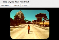
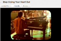
All videos in the music industry demonstrate a genre characteristic, i.e. a stage performance in a heavy metal video or a dance routine for a pop band. From looking at other videos in the music industry, such as 'The Man That Can't Be Moved' by The Script, and 'Stop Crying Your Heart Out' by Oasis (shown in the grabs below), and other videos that are categorised in the same genre of music, we noted that the videos were half performance and half narrative. Although this was not typical of most videos of the alternative rock genre itself, we decided that we liked this idea and tried to develop it in to our own.
Oasis - Narrative
Oasis - Performance
The Script - Narrative
The Script - Performance
In hindsight, the ideal video would have been to film half a narrative with a decent story line to, and also half of a performance video with a whole band in a studio with proper microphones and other instruments, however this was not available to us at the time as no one in the group knew of any one that could help us in this way. As well as this, it would have been very difficult to get the right instruments in to a place where we could film the performance part as the song we used features many instruments that are quite large, i.e. a drum kit and piano.
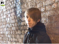
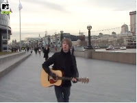
Glenn Performing At First
Glenn Performing In Public
Although this is what ideally we actually wanted to do, we had to be realistic with the time framing that we had, the people that were available and the equipment that we had. The best thing that we could do in regards to half performance and half narrative, was to have Glenn performing for the camera with his guitar in a quieter part of London, and then gradually ease him in to the busier parts and to perform more to the public.
Link Of Lyrics And Visuals
Another convention that we tried to use in the creation of our video was how the lyrics match the visuals on the screen. Below is just 6 of thousands of videos in the industry where the visuals reflect what is being sung.
Lyrics And Visuals
(From top left anti-clockwise)
Geri Halliwell's 'It's Raining Men' has a line "I feel stormy weather moving in" to which grey 'stormy' clouds are seen overhead;
Jessis J's 'Who's Laughing Now' has a line "Your way too late" and there is an extreme close up of the artist singing this with a watch close to her mouth.
Rizzle Kicks 'Down With The Trumpets' has a repetitive line of "Yeah Yeah, lets get down with the trumpets', and there is a trumpet that appears in the video with the artists throughout.
Ed Sheeran's 'Drunk' has the line "I'll be drunk again" to which the artist is seen in a club drinking what appears to be a shot of alcohol, something typical of getting you drunk!
Coldplay's 'The Scientist' is an iconic video that nearly everyone has seen. One of the lines in the song is "I'm going back to the start". The whole video is based on this line as it is all in reverse.
Rihanna's 'California King Bed' and one of the lines is "In this California king bed" and there is an image of a huge bed.
Lyrics and visuals that we used;
Our Lyrics And Visuals
With such a repetitive song, there was only so much that we could do in order to match the visuals and lyrics together. There is the repetitive line of 'What A Life' which is also the song title, so we decided in the planing stages that the idea was to try and convey life across London in as many different ways as possible. Above is some of the visuals that we managed to match with the lyrics being sung.
(From top left anti-clockwise)
"Oh what a sunset on the horizon" was a line that we matched by filming the sun for a small time and then moving the camera across the sky. We felt that this was one visual that we should try and match as the sun is referenced to twice in the song.
This visual is not necessarily seen when the line "What a life" is actually sung, but we felt it was appropriate because we thought that it conveyed life very well. What with it being a street artist, we liked how this was just a normal person either doing it for a living or just to entertain, and we liked this look on life.
"What a life" was sung at this point in the video. We wanted to include as many shots as possible where there were a lot of people around. We thought that filming large groups of people was vital if we were going to convey life.
As above.
This image is of fur different shots from the video. Again, this was not matched to any lyric at the time of being shown as it was in fact an instrumental part of the song. Because of this, we decided to show the instrumental part y Glenn holding up a number of different wooden boards in different locations that read 'What A Life?'. This was one of the conventions that we developed as you do not really see visuals to do with the song when there is an instrumental, nor do you have actual writing that shows lyrics from the song.
"I'm keeping my head down now for the summer" was another line in the song that we took advantage of when editing. In this instance, we again, filmed the sun, and then moved the camera down to eye level to give the audience a sense of moving down, which is exactly what the lyrics say.
In regards to music and visuals, we feel that we have in fact kept this convention and tried to develop it with the instrumental part of the song by still showing words associated with it.
Music And Visuals
The music and the visuals is another convention that we tried to use in the creation of our own music video. Ever single video that is a performance contains a musical instrument. the instruments that are used are the ones that the band would use if they were performing on the stage to an audience.
The song that we chose to try and produce a music video to as 'What A Life' by Noel Gallagher. Noel Gallagher was once part of famous indie rock group Oasis. Oasis were once one of the most notable bands of its genre of music with iconic songs such as 'Wonderwall', 'Stop Crying Your Heart Out' and 'Stand By Me'. Because the song we are using is sung by an artist that was once part of this group, I decided to look at how some of their videos looked. As you can see from above, I have looked at 'Wonderwall' and 'Little By Little' which all feature the individual band members. As well as this one of the videos is part performance and part narrative, and the other, Wonderwall, is a full performance video. Because of this, the instruments that are used to create the music are shown in both. When we were creating our video, we heavily based our model and the ideas from the video on Oasis and their style of music videos. We did this because Gallagher was in fact part of this band.
From looking at the two Oasis videos, you can see that a guitar appears in the 'Little By Little' video which is played by Noel Gallagher, and the other video 'Wonderwall' has every instrument that is heard throughout the song, so a guitar, drum and cello. We wanted to follow this convention so we had our model using the guitar, as shown below in the short video I have created using Final Cut.
We did not however use all instruments that can be heard in the video, simply because we did not have access to them, and we felt it would not have been appropriate to have them in the video seeing as it was a half narrative video, and a full set of instruments tend to appear in a full performance video.
Notion Of Looking
As stated above, one of Andrew Goodwin's conventions that he wrote about is a 'notion of looking'. By this he means that there is a frequent visual of screens within screens or looking through telescopes or binoculars, and that there is also particularly voyeuristic treatment of the female body. In regards to this convention, I do not feel that we have necessarily used this by objectifying something. We have however a few shots where the artist or 'audience' is looking at life around London which could give a sense of looking. The shots can be found below.
Slight Notion Of Looking As 'Glenn' Observes Life
Intertextual References
There is not intertextual references in our video because the song that we are producing a video to has not been used in a film. Intertextual reference only occurs if the song is being used to promote a film, or if the song appears in the film. an example of this is Girls Aloud's 'Jump', which features clips from 'Love Actually'. Click here for the video.
So, that is all of Andrew Goodwin's conventions assessed, however there are others that we adhered to when creating our video.
The editing of a music video depends heavily on the genre of music and also the tempo of the track. An upbeat club song would be edited to the beat with cuts in quick concession. The video would probably lack transitions such as cross dissolves and fades, and would concentrate more on straight forward cutting. This adds to the excitement of the music as the pace of editing matches the pace of the music. We followed the convention of editing to the style of the music. We noted that our song was quite a laid back one so we felt that using straight cuts in quick concession was not necessary. As well as this, because we filmed a half narrative and half performance video, then having lots of quick cuts would have meant the audience would have become confused and not been able to understand the story line and message that we were trying to convey.
Looking back at the video, it is clear that my group were not prepared to take any risks. We did not challenge any conventions on purpose when filming because if we had have gotten it wrong, the video would have been ruined and the audience turned away. We did however challenge some conventions when creating our ancillary tasks.
Ancillary Tasks
Below are the ancillary tasks that my group completed after the production of the music video. There are a number of conventions that we stuck to, as well as some that we challenged when creating the promotional packages. The main and obvious convention that we stuck to was how the products relate to each other and have a consistent house style. Our products do have a house style as the same colours and fonts are used across the two platforms.
Digipak
Digipak
The digipak was created first. The front cover features our model Glenn observing other people. The image is an over the shoulder shot and has been taken in a location that also appears in the video itself. The text is in plain white and clearly shows that the artist is Noel Gallagher and his new band 'High Flying Birds'. I believe that all of this is normal for a front cover of an album, apart from the picture. It is very rare that you have a picture of the back of an artist. Usually, the artist doesn't appear at all, and instead the name is visible, or there is a close up image of the artist to fully make the audience aware whose album it is. I feel that the main image of Glenn is a convention that we have challenged in order to create our digipak. You can see from the research stages of the digipak that every album cover has a picture of the artist where you can see their face.
In regards to the rear of the digipak, I feel that we have not only stuck to the conventions of an album cover, but also developed some. The image is a still image from the video itself, and I think that having this further relates the products together. This is a convention that we developed as most albums either have blank background, or a picture that extends from the front cover. As well as this, I feel that we have developed the idea of how the track listings are presented. The vast majority of CD's have simplistic way of showing the tracks on the album. They do this by displaying the tracks one under the other in numerical order (and accompanying numbers). We however did not chose to do this. We originally wanted to, however the picture on the back was too good to fill it over with text, so instead, we had the track listings one after the other in a horizontal way and without numbers (seen right). After looking at the digipak, I feel that this does work well, especially in the font that it is in.
The other part of the rear of the digipak where a convention was followed was the legal disclaimers and barcode found at the bottom of the album (seen above). The legal disclaimers are something that ALL albums contain. Everything you buy has some small print that no one ever reads, but if you do read the small print on the album, it tells you about the production companies involved in creating the album and a disclaimer prohibiting other people to make copies of the song. As well as this, most albums have their company logo on, and we decided to do this by adding Noel Gallagher's record company logo, Sour Mash. The barcode was also added in the bottom left hand corner of the album, as everything that is intended to be brought from a shop NEEDS to have a barcode for it to be processed and logged.
Magazine
Magazine Advert
The magazine advert has the same image as the one that is used on the digipak. We did this as our research told us that it was a common convention to follow when creating a promotional pack. As stated before, we feel that we should have used an image where the audience can actually see the artist and is not left guessing to who it actually is. Although we would change this if we had the chance to, we feel that we have followed a number of different conventions that we felt were mandatory when creating a magazine advert. The text that we have used is exactly the same as the digipak and is laid out in the exact way. We did this in order to keep a consistent house style across the platforms.
Pull Quote
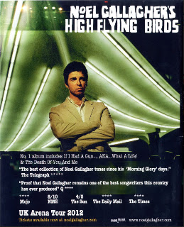
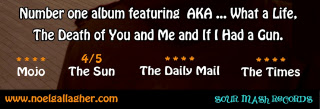
What makes the magazine advert different from the digipak is the extra pieces of text that we have included. The image on the left is of one of the pull quotes that we inserted. We noted that on the majority of posters there are quotes from well known media industries. The quotes that we have used actually appear on Noel Gallagher's own advert for his album and tour. We did this so as to keep the comments and user ratings as real as possible. Noel Gallagher's poster can be seen below. As well as the pull quote that we added to the advert, we also included a tag line to further promote the artist. The line says 'Number one album featuring AKA... What A Life, The Death of You and Me and If I Had a Gun'. The line is advertising Noel's album by naming a few of the songs that are on there. By putting 'Number One' we thought that it further promotes an album as an audience would see that it is doing well in the charts and may consider purchasing it for themselves.
Gallagher's Own Poster
The ratings that we have also inserted is another convention that we have followed in the creation of our advert. Again, the ratings are taken straight off of Noel's poster so that we could use fair ratings that have actually been given to the artist. The ratings are something that we noticed that a lot of adverts contain. We realised that if well known media products such as magazines and TV shows rate an album, then it would cause an audience member to be more inclined to purchase the album. The last convention that we feel we have followed, is by placing our artists website on the bottom of the page, as shown below, and also placing the company's logo on. In this instance, Sour Mash Records is the company that have produced the album. This is Noel Gallagher's own record label and he does not have a specific logo, so we wrote the company in a closest matched text as possible to the one that Gallagher uses himself. All adverts contain a website that promotes the artist further in order to give the audience somewhere to look if they want more information on their desired artist.